Inside
WI > Biocomputing >
Graphics > Photoshop
> Introduction to Photoshop
Introduction
to Photoshop
Interface
Photoshop
is unlike other common software interfaces which emulate virtual typewriters
or graphing paper. Photoshop creates an artist's virtual studio/darkroom.
When you open the program you see a toolbox on the left with tools you
will use to manipulate your images, and on the right, a white square which
is your "canvas" or work area. The gray area surrounding the
canvas is not part of your image, but only defines its edges.
To
change the canvas dimensions, go to Image > Canvas size. You
can type in any dimensions you like, but remember that the area of the
image is directly proportional to the file size.
Basic
Tools
.............Back
to top
(You
can use the letter next to each tool to switch between tools quickly)
Marquee
Tool :  The images in Photoshop are stored pixel by pixel, with a code indicating
the color of each. The image is just a big mosaic of dots. Therefore,
before you can do anything in Photoshop, you first need to indicate
which pixels you want to change. The selection tool is one way of doing
this. Click on this tool to select it, then click and drag on your image
to make a dotted selection box. Hold shift while you drag if you want
a perfect square or circle. Any pixels within the box will be affected
when you make your next move. If you click and hold on this tool with
your mouse button down, you will see that there is also an oval selection
shape, and a crop tool
The images in Photoshop are stored pixel by pixel, with a code indicating
the color of each. The image is just a big mosaic of dots. Therefore,
before you can do anything in Photoshop, you first need to indicate
which pixels you want to change. The selection tool is one way of doing
this. Click on this tool to select it, then click and drag on your image
to make a dotted selection box. Hold shift while you drag if you want
a perfect square or circle. Any pixels within the box will be affected
when you make your next move. If you click and hold on this tool with
your mouse button down, you will see that there is also an oval selection
shape, and a crop tool  . .
Crop
Tool: .
To crop your image, draw a box with the crop tool. Adjust the selection
with the selection points, and then hit return to crop.
Lasso
Tool
: The lasso tool lets you select freeform shapes, rather than just rectangles
and ovals.
The lasso tool lets you select freeform shapes, rather than just rectangles
and ovals.
Magic
Wand:
 Yet another way to select pixels is with the magic wand. When you click
on an area of the image with this tool, all pixels that are the same
color as the pixel you clicked will be selected. Double click on the
tool to set the level of tolerance you would like (i.e. how similar
in color the pixels must be to your original pixel color. A higher tolerance
means a broader color range).
Yet another way to select pixels is with the magic wand. When you click
on an area of the image with this tool, all pixels that are the same
color as the pixel you clicked will be selected. Double click on the
tool to set the level of tolerance you would like (i.e. how similar
in color the pixels must be to your original pixel color. A higher tolerance
means a broader color range).
The
Move Tool:
 This is a very important tool, because up until now all you have been
able to do is select pixels, and not actually move them. The move tool
not only allows you to move areas you have selected, but also to move
entire layers without first making a selection. If you hold the option
(or alt) key while clicking and dragging with the move tool,
you can copy the selection.
This is a very important tool, because up until now all you have been
able to do is select pixels, and not actually move them. The move tool
not only allows you to move areas you have selected, but also to move
entire layers without first making a selection. If you hold the option
(or alt) key while clicking and dragging with the move tool,
you can copy the selection.
Airbrush
 Paintbrush
 and Pencil
tools
and Pencil
tools  can be used to draw with the foreground color on whichever layer is
selected. To change the foreground color, double-click on it in the
toolbox. You will then see a palette of colors from which to choose.
Select one and click OK. To change the brush size, go to Window >
Show Brushes.
can be used to draw with the foreground color on whichever layer is
selected. To change the foreground color, double-click on it in the
toolbox. You will then see a palette of colors from which to choose.
Select one and click OK. To change the brush size, go to Window >
Show Brushes.
Eraser
Tool:  Erases anything on the selected layer. You can change the eraser size
by going to Window > Show Brushes.
Erases anything on the selected layer. You can change the eraser size
by going to Window > Show Brushes.
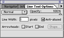
Line
Tool:  Can be used to draw straight lines. Click on the tool to select it,
then click with the tool on the canvas area and drag to draw a line.
When you release the mouse button, the line will end. You can change
the thickness of the line or add arrowheads to it by double clicking
on the tool to see this dialog box:
Can be used to draw straight lines. Click on the tool to select it,
then click with the tool on the canvas area and drag to draw a line.
When you release the mouse button, the line will end. You can change
the thickness of the line or add arrowheads to it by double clicking
on the tool to see this dialog box:
Text
tool:  Click on this tool to select it, then click in the Canvas area. You
will be given a dialog box in which to type your text, and choose its
attributes. Each new block of text goes on its own layer, so you can
move it around with the Move Tool. Once you have placed the text, however,
it is no longer editable. To correct mistakes, you must delete the old
version (by deleting its layer) and replace it.
Click on this tool to select it, then click in the Canvas area. You
will be given a dialog box in which to type your text, and choose its
attributes. Each new block of text goes on its own layer, so you can
move it around with the Move Tool. Once you have placed the text, however,
it is no longer editable. To correct mistakes, you must delete the old
version (by deleting its layer) and replace it.
Eyedropper: Click with this tool on any color in the canvas to make that color the
foreground color. (You can then paint or type with it).
Click with this tool on any color in the canvas to make that color the
foreground color. (You can then paint or type with it).
Magnifier: Click with this tool on a part of your image you want to see closer,
or drag with it to define the area you want to expand to the size of
the window. Hold down the Option or Alt key to make it
a "reducer" instead and zoom back out.
Click with this tool on a part of your image you want to see closer,
or drag with it to define the area you want to expand to the size of
the window. Hold down the Option or Alt key to make it
a "reducer" instead and zoom back out.
Grabber: Click with this and drag to move the entire page for better viewing.
Options
Bar

The
Options bar appears at the top of the screen and is context sensitive,
changing as you change tools. The tool in use is shown in the left corner,
and options relating to the tool appear to the right of that.
For
example, in the snapshot above, the move tool is selected.
Auto
Select Layer when checked means that
the move tool will switch layers automatically depending where you
click on the canvas. This makes it feel almost like a vector program
when you are selecting objects. The layer palette still shows you
what is on each layer and you can use it to select objects as well.
Show
Bounding Box makes
it easy to rotate or transform an object when you click on it. When
the cursor is held over the corners of the bounding box, it turns
into a curved arrow. Click and drag to rotate.
Layers
............Back
to top
Photoshop
works on a system of layers, which are like sheets of transparency.
When you place objects on a layer, they become part of the layer, just
as if you had drawn on a transparency with a marker. If two objects
are on the same layer and you want to move them closer to each other,
you need to cut them out with the lasso or marquee tool and physically
move them together. If they are on different transparent layers, however,
all you have to do is move the layers with the move tool until the objects
are closer to each other.
 |
 |
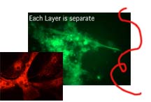
| In
a file with overlapping elements, putting them on different layers
allows me to move them around without having to select them first. |
To
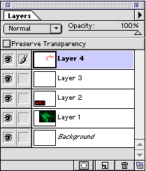
see all the layers in your document, go to Window > Show Layers.
Here are the layers for the image on the left. The eye icon on the
left indicates that the layer is visible. Click on the eye to make
a layer invisible. Select a layer and then click the trash icon
at the bottom to delete a layer. Click and drag on layers to change
their stacking order. |
Resolution
/ Dimensions of Image / Size of File
.............Back
to top
Pixels
per Inch
Photoshop files are made up of tiny squares of color called pixels.
Using large pixels will make a grainy image, and using tiny pixels to
make the same image will be much smoother. However, the smaller the
pixels, the more of them there are in the file, and the larger the file
size will be. If the file size is large, it opens slower, takes longer
to save, and takes up more room on a disk. The the key in choosing a
resolution is finding the balance between image quality and file size.
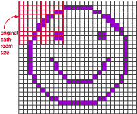
For example, if I want to re-tile my bathroom floor to make a smiley
face, I can either use large tiles or small tiles. On the left I use
10 tiles on each side for a total of 100 tiles. On the right I use 25
tiles on each side, for a total of 625 tiles.
.
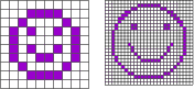
If each of these images measures an inch on each side and each tile
is a pixel, the image on the left would have a resolution of 10 pixels
per inch, or 10 ppi. The image on the right would be 25 ppi. Notice
how a small increase in resolution corresponds to a much larger increase
in file size, because the increase is exponential.
You
can begin to see why images of different resolutions sometimes change
size when combined in one file, or when brought into other programs.
For instance, what if I wanted to draw the image on the right in tiles
the size of the image on the left? I would have a much larger image
in the end. This is what happens when you bring an image with a high
resolution into a file which has a lower resolution. There can only
be one resolution per file, so the pixels of the image coming in are
resized to the size of the existing pixels in the file.
Image
Size Dialog Box
JPEG
images from the Internet have a low resolution of 72 dpi. However
there is no reason that your JPEG images have to have such a low resolution.
Image files generated by digital cameras often begin with a low resolution
but very large dimensions. You can use that to your advantage by trading
area for resolution. To change the resolution or the size of your
image, go to File > Image Size. It
will look something like this.
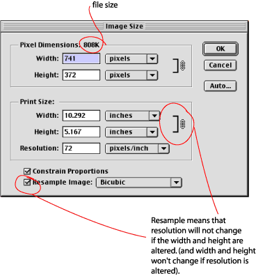
At
the bottom of the window there is a box marked "Resample Image".
This box determines whether or not area can be exchanged for resolution.
When it is checked, resolution remains independent of the image dimensions.
If you change the dimensions or the resolution, you will see the file
size change accordingly.
To
exchange area for resolution, uncheck the Resample Image box:
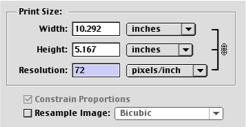
You
can see that the linking symbol on the right now encompasses width,
height and resolution. Perhaps you don't need a 10 inch wide image.
If you make the width smaller, look what happens to the resolution:

What
is happening is simply that the pixels in your image have been decreased
in size. The total number of pixels and therefore the file size remains
the same. If you had used the resample option, pixels would have been
added or removed from the image and the file size would have increased
or decreased.
What
resolution is best?:
300 is optimal, between 200 and 300 is okay, but below 200 the image
will begin to show pixelation.
When
to resample:
When
you have two images of different resolutions that you want to combine
in Photoshop and you don't want either of them to change in dimension,
you will have to resample one of them to bring them to the same resolution
before combining them. This is because a single file can have only
one resolution. When you bring in an image from a file with pixels
of a different size, Photoshop will enlarge or shrink the pixels to
match those in the file into which the image is going. Bringing an
image with a resolution of 300 ppi into a file with 72 ppi will make
the first image appear much larger when it arrives in the new file.
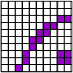
Why? It is the same as if I decided to make my detailed smiley face
in the larger tiles instead of the small ones. I would need a much
bigger bathroom!
 |
 |
| Tiling
my detailed face in larger tiles |
This is why I really need to change the tile size first! |
Also,
if you have an extremely high resolution that you don't need, you
can resample down to 300 to save disk space.
Tonal
Adjustment
.............Back
to top
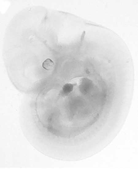
Sometimes
a scan or even a digital photo won't look like what you saw under the
microscope. There are some easy ways to adjust the color in an image.
As long as the adjustment is made to the entire image, and not to selected
parts, it should be OK ethically, although you should use your own judgment.
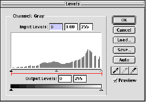
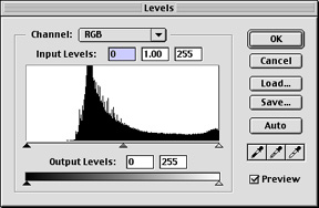
Levels
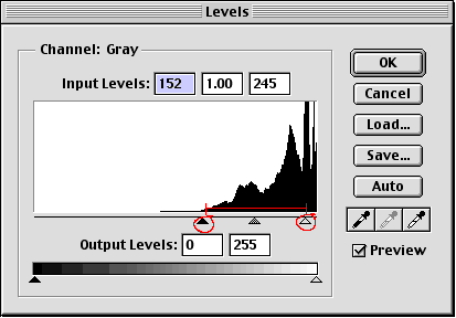
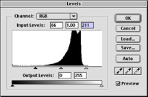
Sometimes
an image will seem faded or washed-out. Using the Levels adjustment
can increase the contrast in the image. Go to Image > Adjust
> Levels. You will see this dialog box with a histogram showing
the tonal values in the image. Here the curve is shifted to the right,
which corresponds to what we can see--the image is too light.
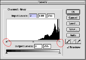
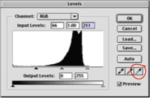
By
moving the circled sliders toward the bell-shaped part of the curve,
we can reset the value of the darkest and lightest pixels in the image.
Moving the black arrow to the right will darken the darkest values
in the image, and moving the white slider to the left will lighten
the lightest values in the image.
Watching
how the changes affect the image, let's gradually move the sliders inward
to the edges of the curve.
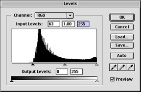
When
we click OK, Photoshop will reset the curve, with our placed arrows
as endpoints:
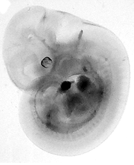
(Going
back into Levels, we can see our new tonal values curve)
As
you can see, what the levels adjustment did was take a segment of the
tonal range and reassign the values from black to white. In the readjusted
levels dialog box, you can see spaces indicating values that no longer
exist. This is the difficulty in making image adjustments. When you
over-adjust, you begin to leave gaps in the tonal range, and this will
eventually cause a posterized look (too much black & white and not
enough middle gray tones). The only way to avoid this is to capture
a large range of tonal values when scanning or taking a picture, and
to use only subtle adjustments to the images.
Using
Levels on color images:
 |
 |
 |
 |
| In
this image the background wasn't quite black. |
Moving
the dark slider to the right deepened the darks. |
 |
 |
 |
 |
 |
 |
| Values
are lacking at both ends of the curve. |
Move sliders inward |
Click with highlight dropper in the lightest part of the image to
correct color imbalance. |
Back to top |